Designing for the metaverse – three tips from our expert

The metaverse is here and brands are jumping at the chance to create a virtual presence in the space. In the not-so-distant future, designing for a virtual world will be expected in digital design roles and there’s no better time than the present to start getting your head around it. But how do you design a virtual space in a way that doesn’t immediately overwhelm your visitor? What are the rules to follow when creating an experience from scratch? Our virtual design expert, Marc Dalemans, has three useful tips for you.
The meta what?
Let’s start with “what the heck is the metaverse anyway”? Simply put, the metaverse is a 3D virtual world with social interaction at its heart. While currently still in its beta version, it’s growing fast and becoming a reality that might soon turn our lives upside down. In fact, jobs for the metaverse are already popping up and Gucci, Nike and many other brands are entering the metaverse with 100% virtual fashion shows.
If the metaverse is set to be the next online revolution and we’re likely to get a second virtual life, one thing is for sure – design and user experience better be on fleek. But what do you even need to consider when designing for the metaverse? And how do you create outstanding user experiences on a platform that doesn’t even fully exist yet?
Tip 1: Use “content zones”
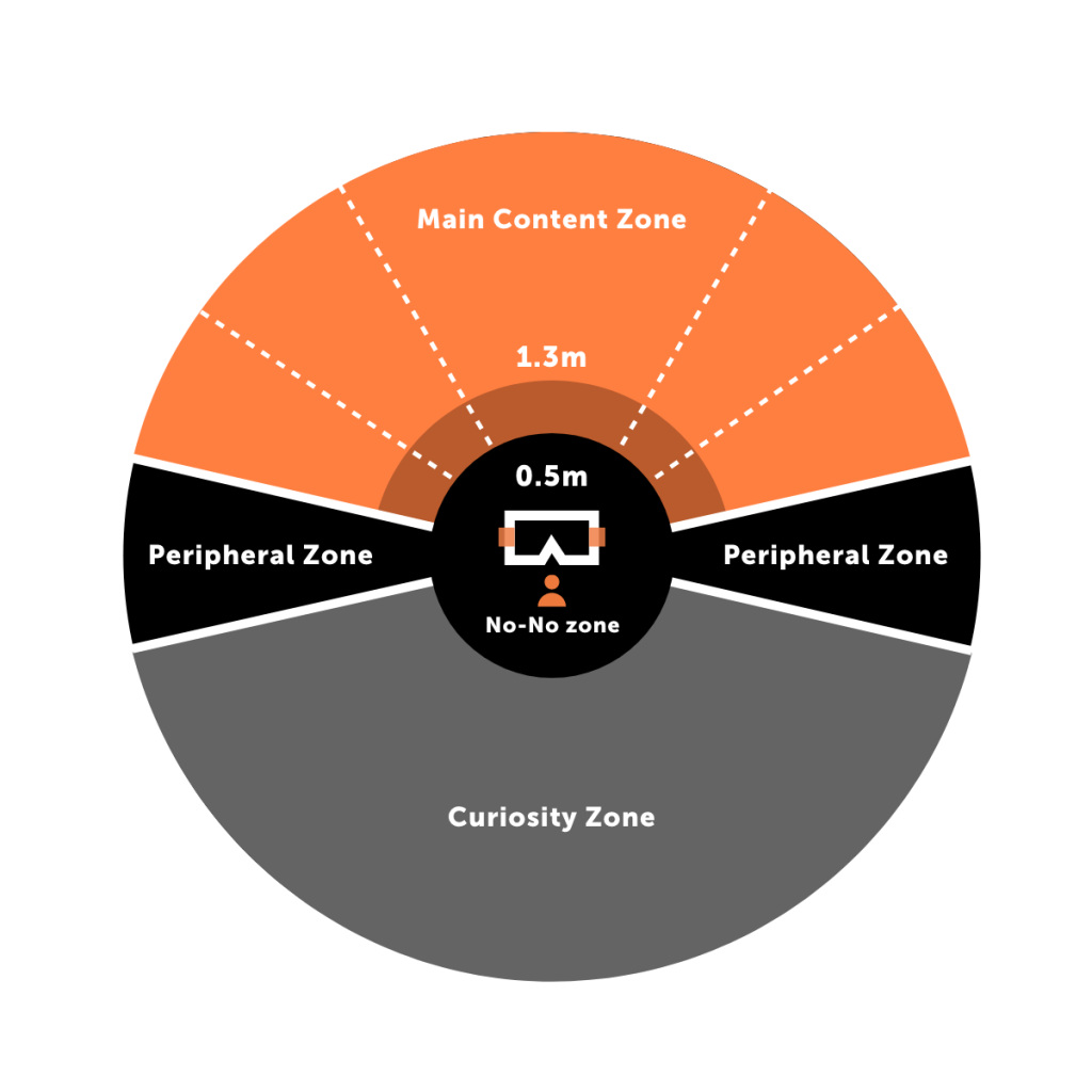
Mike Alger is a VR virtuoso. He puts his talent to work for Google by creating volumetric digital interfaces. He did several pieces of research on comfortable viewing angles and content positioning and developed the concept of “content zones”. In a nutshell, content zones are the places where you put the elements of a user interface in a virtual environment.
But how do you go about doing that? Imagine yourself sitting on a couch. You wouldn’t want to have to turn your head around in all directions to see what’s going on while wearing your VR headset. Therefore, content zones should be visible to you without having to turn your head too much. When designing for VR, it’s important to consider the following:
- We tend to look 6° below the skyline. Make sure to place your UX elements accordingly – a little bit below the skyline.
- Model your content zones with a diagram to know where to set your content.
- With the exception of the settings, you shouldn’t place any interface elements closer than 50 centimetres to the user as they will be way too close.
- Ideally, place your content between two and ten metres away.
- Keep the curiosity zone for less important content.
- Always keep in mind that the user’s physical orientation influences where the content is displayed.

Tip 2: Manage the content size
It’s not an easy thing to imagine what your content size should be on virtual screens. And it’s even more of a challenge to create homogeneous content that will fit the size of any VR screen. Google introduced the concept of Distance-Independent Millimetre or DMM. A DMM is one millimetre viewed at one metre away.
The DMM is now a common measurement for virtual content, for which Google has put together guidelines for font sizes that are readable for most people.
Tip 3: Aim for user comfort
The virtual world does not follow the rules of the real world down to every detail. But some things should be coherent. Here is what you need to consider when designing for VR:
- Do not attach anything to the camera.
- Make sure to use a coherent scale compared to the real world.
- Users should stick to the ground, gravity also exists in the virtual world 😉
- Include a background (it can simply be the sky).
- Don’t try to surprise the users.
- Use sound purposefully.
- Make sure to clearly communicate the actions that are expected from the user with specific hover colours, text or sounds. The user needs to know what to do.
The skills you’ll need to design for the metaverse
For now, designers will have to work hand-in-hand with Unity programmers to create their virtual visions. Above all, designers need to immerse themselves in VR games and spaces to fully understand the frustrations users will experience in the metaverse. Experiencing as many VR situations as possible in order to improve UX is really what will help designers create amazing metaverse design for users.
A skilled designer… and who else?
The key to successful metaverse projects lies in finding the right objectives, where the virtual experience will bring real added value. Depending on the specific tasks you’ll need to accomplish, make sure to surround yourself with the right experts. For example, you might need help from athletes who do not know anything about digital conception but who know a lot about motion in space. You’ll need to work with them to design an experience that’s as natural and true to the “real world” as possible.
Two key roles will be the 3D modellers and Unity programmers. The 3D modeller is in charge of shaping the virtual world in which the user will operate. The Unity programmer designs and develops software and applications on Unity (the software of choice for VR developers).
Finally, a project manager with extensive knowledge in landscape architecture should be in charge of managing the team and leading the project to completion.
Now that you have a bit more information about designing for the metaverse, you might feel ready to tackle your first project. We say go for it! Just bear in mind that, as with every new tool, it is going to evolve. And as we start understanding the metaverse better, new requirements will continue to pop up as well as new profiles that you’ll need to add to your dream metaverse building team. Want to know more on how we can help you build a great VR experience or step into the metaverse? Contact our experts!
Sources
Our recent blog posts
See all blogs-
How is AI’s synthetic data enhancing User Experience Research? Technology

-
Web3.AI Rising : How new technology can add value to your business

-
How generative AI helped us create an e-commerce app – with personalised content – in just 2 weeks Technology

-
Can you build a foodie app in 3 days using Generative AI? (Spoiler alert: yes!)

